
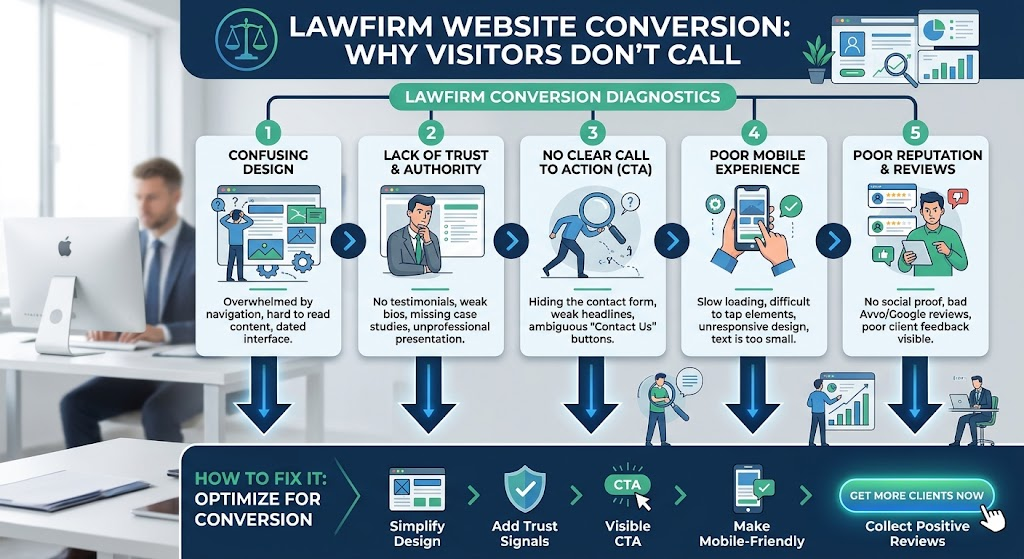
A law firm website can rank well, earn clicks, and still produce almost no consultations. The problem is rarely traffic. It is what happens in the first ten seconds after someone lands, usually on a phone, usually under stress, and usually while comparing three firms in three open tabs.
Most advice on this topic is a generic checklist: add a contact form, add testimonials, make the site mobile friendly. Those tips are fine, but they treat the website as a set of separate pages. A better method is to audit the path. Follow one visitor from the first screen to a confirmed consultation request, and count every point where they might hesitate.
Here is how to run that audit on your own firm’s site.
1. Run the answer test in five seconds
Open your homepage or a practice area page and show it to someone outside the legal field for five seconds. Then ask three questions: What does this firm handle? Where do they practice? What should I do next?
If any answer is unclear, you have found your first leak. Visitors who need a divorce attorney or a DUI defense lawyer do not read long introductions. They look for the practice area, the location, and a clear next step, all on the first screen.
2. Count the taps between a visitor and a human
Someone searching for a lawyer is often dealing with something urgent. Every extra tap between landing on your site and reaching a real person costs you leads.
On your phone, check how many actions it takes to call the firm or request a consultation. The target is one. A call button that stays visible while scrolling, plus a short form on the same screen, removes most of the friction. Pages that bury the phone number in a footer or a “Contact” submenu quietly send those visitors to a competitor.
3. Show proof that matches the case, not just the firm
Generic trust signals, such as “experienced attorneys” and “dedicated to our clients,” appear on nearly every legal website, so visitors skim past them. Proof works better when it matches the visitor’s situation.
On a personal injury page, show case types you handle and what clients can expect after the first call. On an estate planning page, explain the first meeting in plain language. Attorney bios, bar admissions, and specific practice focus should sit next to the call to action, not on a page three clicks away.
4. Protect the speed of the first screen
Speed is often discussed as a technical score, but visitors experience it as a feeling: does the page respond right away or not? Heavy sliders, autoplay video, and oversized images are common causes of a slow first screen.
For conversion, focus on what loads first. The headline, the phone number, and the main button should appear almost immediately, even if lower sections load a moment later.
5. Build forms that respect urgency
Long intake forms look thorough, but they discourage people who are not yet sure they will hire you. Start with the minimum: name, phone or email, a short description of the matter, and a preferred contact time.
Add one sentence under the button that sets expectations, such as how quickly someone will respond. It lowers anxiety and increases completed submissions. If your firm cannot answer every call, say what happens after hours instead of leaving the visitor guessing.
6. Measure consultations, not just visits
Traffic reports can make a site look healthy while the phone stays quiet. Track the actions that matter: call button taps, form submissions, and booked consultations, broken down by practice area page.
This shows which pages attract visitors but fail to convert, so you can fix the weakest page first instead of redesigning everything.
Where design fits in
Every fix above is easier when it is built into the structure of the site instead of patched on afterward. That is the practical value of strong law firm web design: the layout, page hierarchy, and calls to action are planned around how a prospective client actually decides, not around decoration.
Elevate Web Designs, based in Grand Junction, Colorado, works with law firms across the United States and pairs affordable, high performing sites with personalized support. That support matters most after launch, when the data from your audit shows what to improve next.
A quick self audit checklist
- A stranger can state your practice area and location within five seconds.
- Visitors on a phone can call or request a consultation in one tap.
- Each practice page shows proof that fits that specific case type.
- The headline, phone number, and main button load first.
- Your form asks for the minimum and states when you will respond.
- You track calls and form submissions by page, not just total visits.
If you can check every item, your site is already ahead of most firms in your market. If not, start with the first unchecked box. Small changes to the path from landing to consultation usually matter more than a full redesign.
Frequently Asked Questions
Why does my law firm website get traffic but few consultations?
Usually the problem is the path after the click: an unclear first screen, a hidden phone number, generic trust signals, or a long form. Fixing the path often matters more than adding more traffic.
What is a good conversion goal for a law firm website?
No single number fits every practice area, so compare your own pages against each other. Track call button taps, form submissions, and booked consultations for each practice page, then improve the weakest one first.
Should every practice area have its own page?
Yes. A dedicated page lets you match the proof, wording, and call to action to one type of case, which feels more relevant to a visitor than a general services page.
How often should I review my website’s conversion path?
Check it every quarter and after any major change to your pages, forms, or phone system. A five second test and a quick walkthrough on your phone take only a few minutes.
Do I need a full redesign to improve conversions?
Not always. Start with the first screen, the call button, and the intake form. Small changes to these often increase consultation requests before a redesign is needed.